

Mixing Patterns and Prints in the Bedroom
When mixing patterns, it’s hard to get the balance right. Too many and you overwhelm the space, yet a completely pattern-free room lacks personality. We'll show you how to reach that sought-after middle ground and achieve a fresh, modern look.
Why Use Pattern?
The use of patterns appears to contradict Scandinavian design’s clean, simple ethos, but that’s only part of the story. Certain patterns—particularly stripes and grids—make a space feel larger, and thus have an important function in tiny Scandi homes.
In fact, some of interior design’s most popular patterns originated in Scandinavia. The past few years have seen a resurgence in the vibrant floral daubs of the Finnish design house, Marimekko. Josef Frank’s iconic Teheran cushion often provides a bold counterpoint to all-white Swedish rooms. And trailblazing Dane Marie Gudme Leth wowed audiences with her botanical printed textiles, all the way back in 1930.

Remember, too, that while Scandinavian design is simple and functional, it should never feel clinical. There should always be an element of your personality in your home; this is one of the main differences between Scandinavian design and minimalism. Pattern transforms your space from a showroom lookalike to a room that’s uniquely yours.
Get Planning
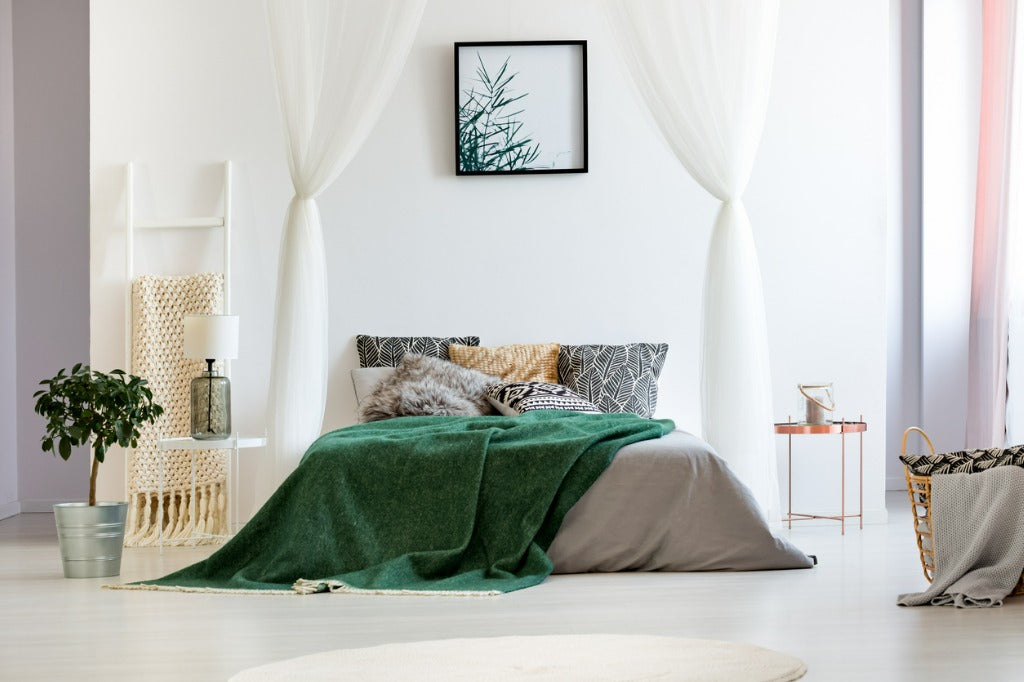
It’s best not to jump straight in with patterns; before you hit the shops, think about the atmosphere you’re trying to create. Each print has its own personality—damask has a traditional look while paisley, florals, and animal print are more bohemian. Stripes and other geometric patterns will create a clean, modern look.
Choose your colors ahead of time—otherwise, you risk getting distracted and may end up with a bunch of patterns that you love individually but don’t complement one another. Read our piece on using color in Scandinavian design, build a color scheme you love, and keep those colors with you in a sketchbook or on your phone as you shop around. And remember, black and white can be a color scheme too!

Start With Your Statement Piece
It’s best to have just one bold “statement” pattern per room. Perhaps it’s something new—maybe one of our printed European linen duvet covers—or perhaps you have a family heirloom in a difficult-to-match design. Start with this item and use it as the focal point around which you build the rest of the room. Leave paint to the end; it’s much easier to find paint to match fabric than it is to find fabric to match a paint color.
Snap a photo of the print and import it into a program such as Adobe Color, which will create a color scheme for you based on that item. When choosing your complimentary pieces, look for items in those colors, and keep those patterns at a small-to-medium scale—think houndstooth, herringbone, or pinstripe. Otherwise, you risk creating competing focal points that will make the room look busy. Many designers release collections of complimentary patterns and prints, so start there if you are unsure.
Keep Your Color Palette Simple
Mix patterns of the same color, or patterns that share a common color. For example, if you’re looking for floral-print curtains to match red-and-orange striped cushions, the floral print should feature red or orange (or both). This will give your space cohesion, even if the patterns are wildly different.
Even better, anchor your patterns by pairing a print with a solid color. We’ve done the hard work for you: our European linen duvet covers each have complimentary solid-color pillowcases and fitted sheets available.
Overall, it’s best to work with no more than three colors. However, this doesn’t include neutrals like black, white, and grey.
Use Contrast to Create Balance
All prints and patterns exist on a scale—small-scale to large-scale, geometric to organic, simple to intricate. Professional interior designers pair items on contrasting ends of the scale to create a space that looks balanced. Think delicate pin-dot chairs on a wide-striped rug; herringbone cushions on a damask sofa; our Porse Scandinavian duvet cover paired with a tight graphic print.

Have Fun
Fear of making mistakes puts many people off patterns but remember, if it doesn’t quite work, it’s not the end of the world. Shopping at thrift stores is a sustainable and inexpensive way to experiment; when buying new, always check the return policy. Our Danish-style bedding has a 30-day return window, so you can buy in complete confidence.
How will you apply these tips to your own space? Do you have a favorite pattern? Let us know on Instagram, Pinterest, Facebook, or Twitter!
Read more

The Differences Between Danish, Norwegian, Swedish, and Finish Design
When it comes to design, Scandinavian countries are often grouped together. Although similar, their design aesthetics differ in a few distinct ways. See how.
Read more
From the food to the festivities, December is a special time of year in Nordic nations. See how to decorate your home for the holidays, the Scandinavian way.
Read more
Leave a comment
This site is protected by hCaptcha and the hCaptcha Privacy Policy and Terms of Service apply.