How to Make “Danish Maximalism” Work in Your Home
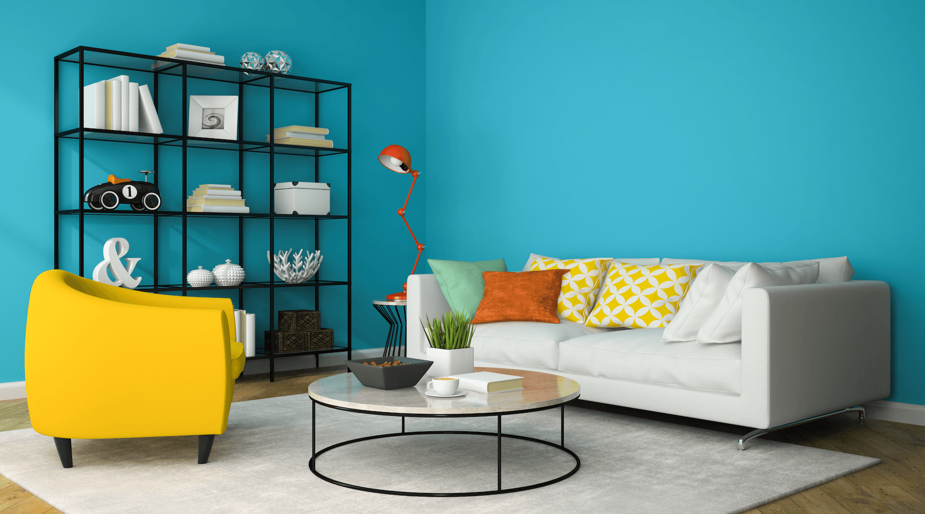
Danish designers are abandoning whites and grays in a return to their colorful roots—but after years of all-neutral decorating, it's hard for homeowners to know where to start. In this post, we break down the Danish Maximalism style—and how to make it work in your space.
What is Danish Maximalism?
The minimalist, all-white interiors we’ve come to associate with Danish design are a recent trend. The Vikings were known for their use of color and iconography, with patterned shields and textiles in yellow, red, and orange, dyed using roots and berries. These colors are still characteristic of Copenhagen’s streets, most obviously in the Nyhavn and Christianshavn neighborhoods.

Even through the 50s and 60s—the mid-century “golden age” of Danish design—designers favored a vibrant palette. Finn Juhl and Arne Jacobsen’s chairs came in burgundy and mustard yellow; the Spiegel publishing house, designed by Verner Panton, seemed made for a 90s game show.
No one quite knows what caused the shift to neutrals in the following years; perhaps it was the influence of neighboring Sweden, accelerated by the homogenizing effects of the Internet. But, as the New York Times reported in January, Danes are starting to turn against the neutral aesthetic. Danish design houses Georg Jensen, Lyngby, and Louis Poulsen have all re-released iconic pieces in colorful shades; new designers, such as drapery designer Arne Aksel and glassware designer Helle Mardahl, are rebelling against the all-white homes they grew up in.
With their years of training and experience, Danish designers intuitively understand how to integrate these pieces into their space. If you’re not a professional, however, you might feel daunted by color, especially if you haven’t used it much before. Fortunately, there are a few design rules you can follow to take the guesswork out of creating a colorful space.

An Introduction to Color Theory
Why do some color schemes seem to magically work, whereas others look jarring? It’s all down to color theory.
Color theory is based on the color wheel, which is made up of the six primary and secondary colors—red, orange, yellow, green, blue and purple—arranged in a circle. You can also draw a more advanced color wheel using tertiary hues, e.g. blue-green or yellow-orange. Color schemes are made up of different arrangements of colors on the wheel: a “complimentary” color scheme uses two colors on opposite sides of the wheel, whereas an “analogous” scheme uses two or more colors next to one another.
There are many more complex schemes you can make—split complimentary, triad, rectangular—and fortunately, you don’t need to remember or even fully understand them to use them. Online tools, such as Adobe Color, will do the work for you: just pick your favorite color on the wheel and flip through the various color harmony rules to generate your color scheme.
A Handy Color-Scheme Hack
You don’t need to start from scratch when creating your color scheme: there are all sorts of color schemes available to you through art, design, or nature. You could, for example, analyze the color values and proportions in your favorite painting, a bird’s plumage, a sunset, or a butterfly’s wing. You can even import a photo into Adobe Color and choose from a selection of automatically generated color palettes.
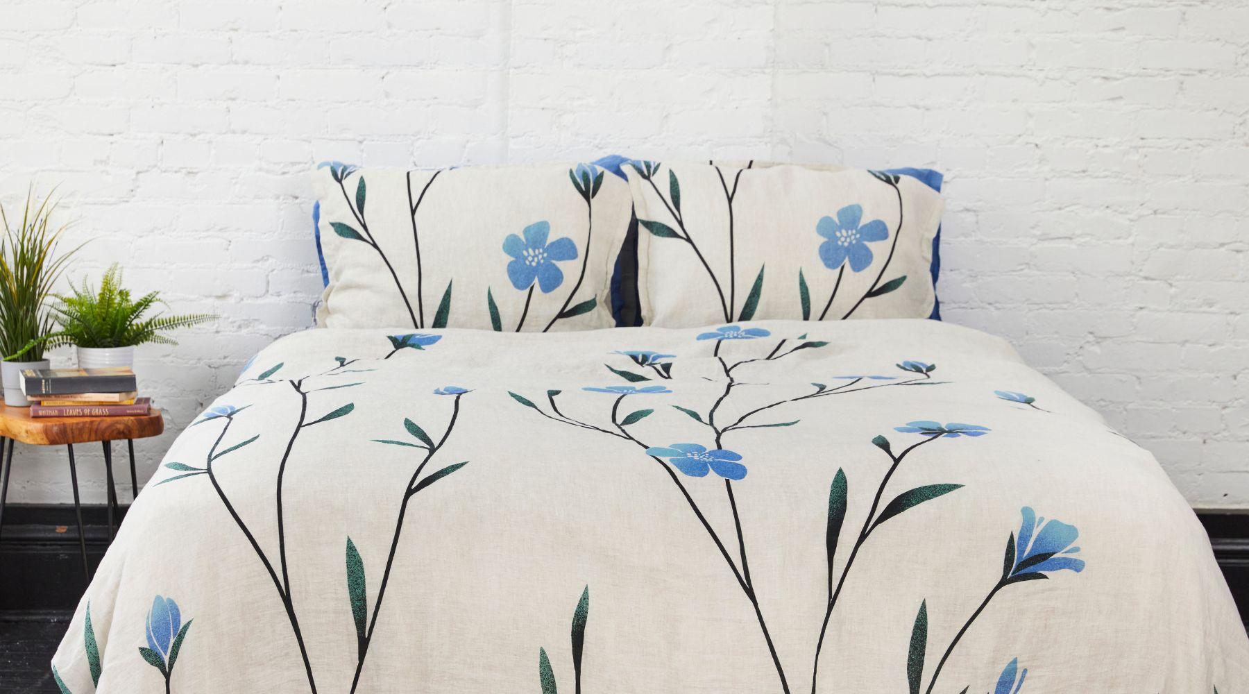
Even better: create your color scheme using something you plan to put in the room you’re decorating, such as a wallpaper or textile. For example, we created the five-color theme below using a photo of our Fugle Scandinavian-design bedding.

The 60-30-10 + B/W Rule
Once you have your preferred colors, it’s time to think about proportions. Using three colors in equal amounts can look jarring, as this rarely occurs in art or nature. Better to use a combination of main and accent colors—fortunately, designers have a rule in place for that too.
The 60-30-10 + B/W rule is roughly based on the golden ratio, a ratio that often occurs in nature and can be used as a “cheat code” for many aspects of interior design, including color proportions. The idea is that 60 percent of your space (walls, floor, large furniture items) should be one main color, 30 percent (e.g. textiles, such as curtains and Nordic-style bedding) should be a harmonious accent color and 10 percent (artwork, ornaments) should be made up of contrasting “pops” of color. The B/W stands for black and white, which exist outside of this ratio—the idea being that you can use subtle black and white accents to anchor the other colors. There’s also nothing stopping you from using white (or off-white) as one of your main colors—in fact, this can be a good way to integrate color without going overboard, as you can see in Finn Juhl’s house.
Within your three chosen colors, you should have slight variations to keep your space from looking too formal. For example, if your main color is a certain shade of blue, you can also pick slightly lighter or darker shades of blue within that. Aim for around seven to nine colors in total.
Remember the Principles of Scandinavian Design
Although Danish Maximalism may seem like a complete departure from the old ethos, it’s not: in fact, all these new designs still adhere to the fundamental principles of Scandinavian design. No matter what colors or materials they play with, Danish designers create objects that are clean-lined, functional, durable, and sustainable. Whether you’re buying directly from them or simply taking inspiration, always decorate with these principles in mind.
Our Scandinavian-style duvet covers—which come in bold print or solid-color designs—work perfectly in a Danish Maximalist space. They’re made from organic European linen—a durable and thermoregulating fabric that’s net carbon-negative. What’s more, we’ll offset the carbon emissions from shipping, so you can buy with peace of mind.
Do you prefer neutral or colorful spaces? Will you be incorporating Danish Maximalism into your home? Let us know on Instagram, Pinterest, Facebook, or Twitter!


Leave a comment
This site is protected by hCaptcha and the hCaptcha Privacy Policy and Terms of Service apply.